
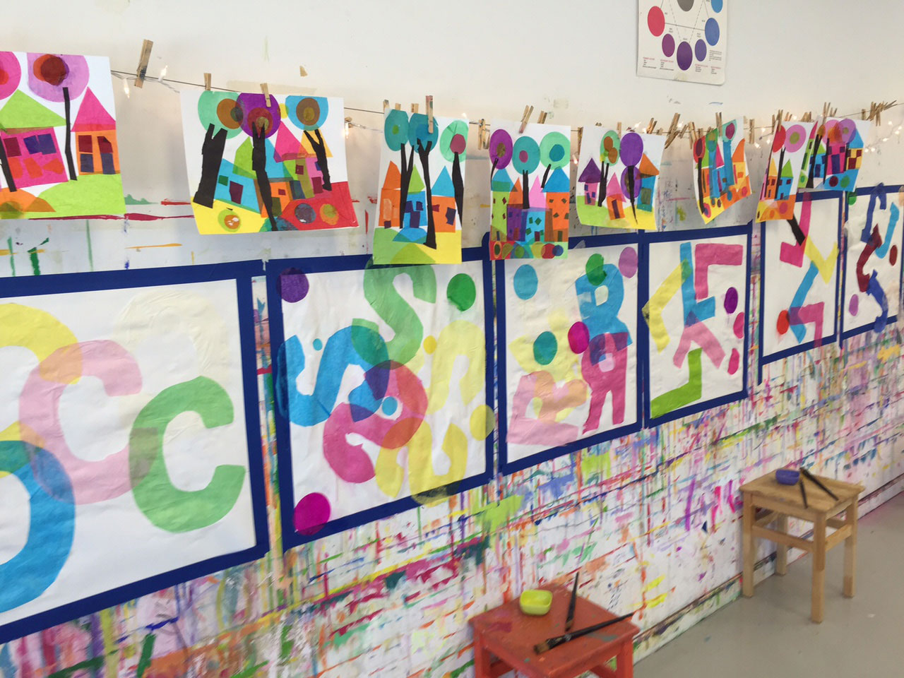
Our new favorite project of the moment is inspired by a love of typography and an admittedly unhealthy obsession with fonts (hello Lato): thus Decoupage Typography is born.
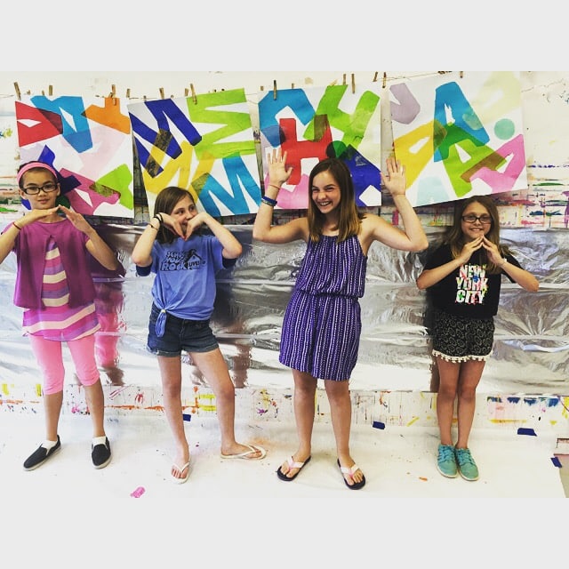
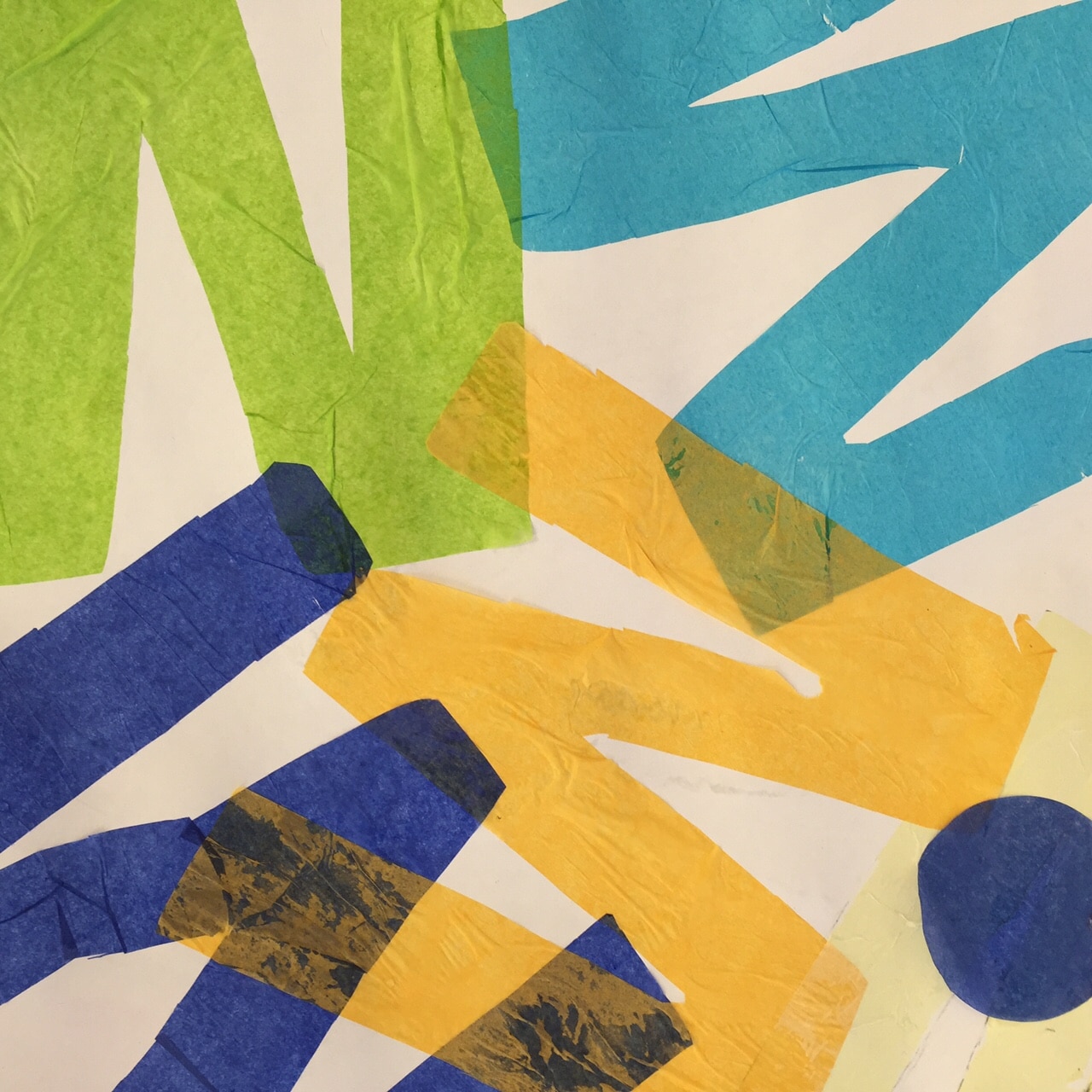
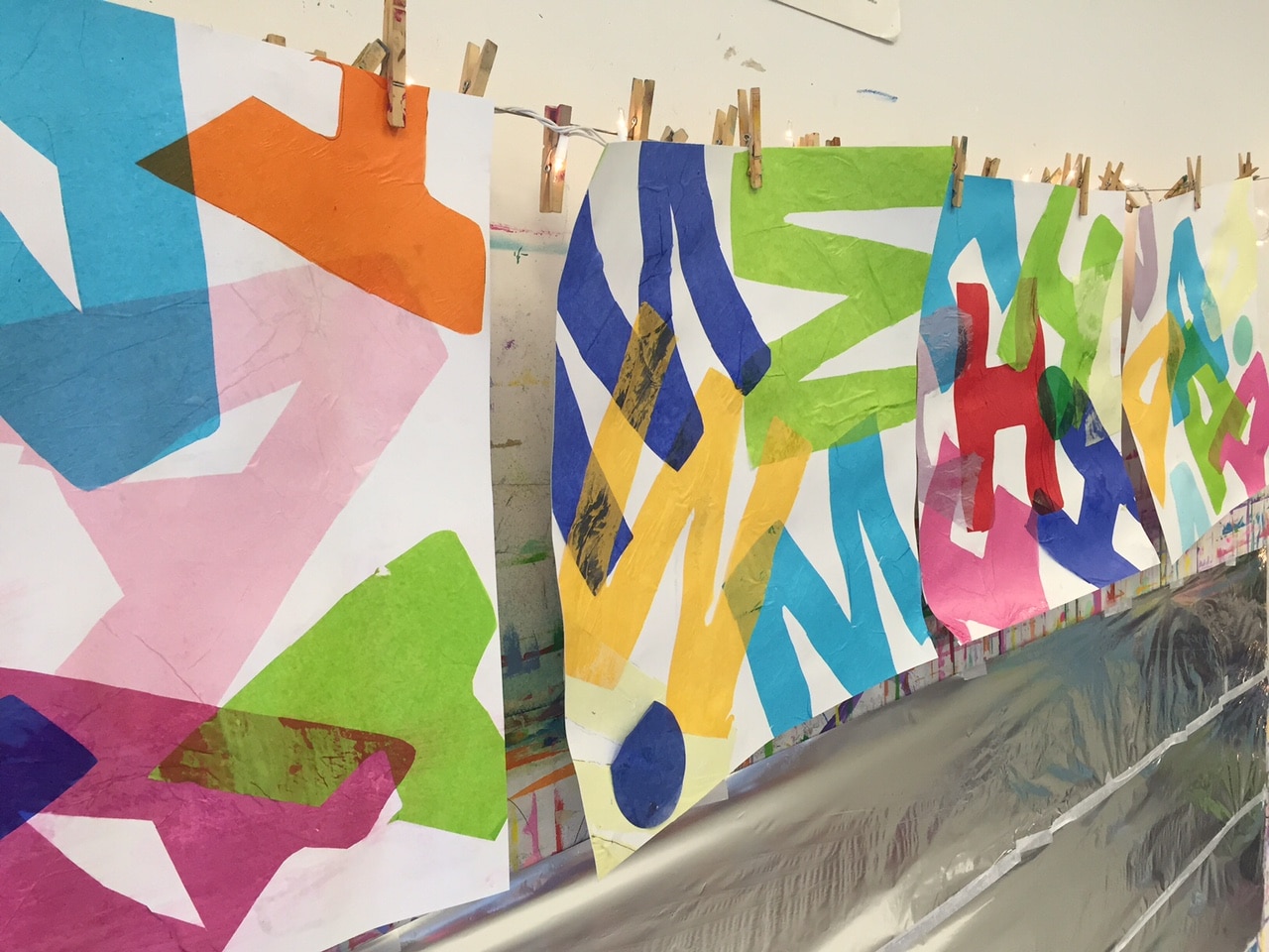
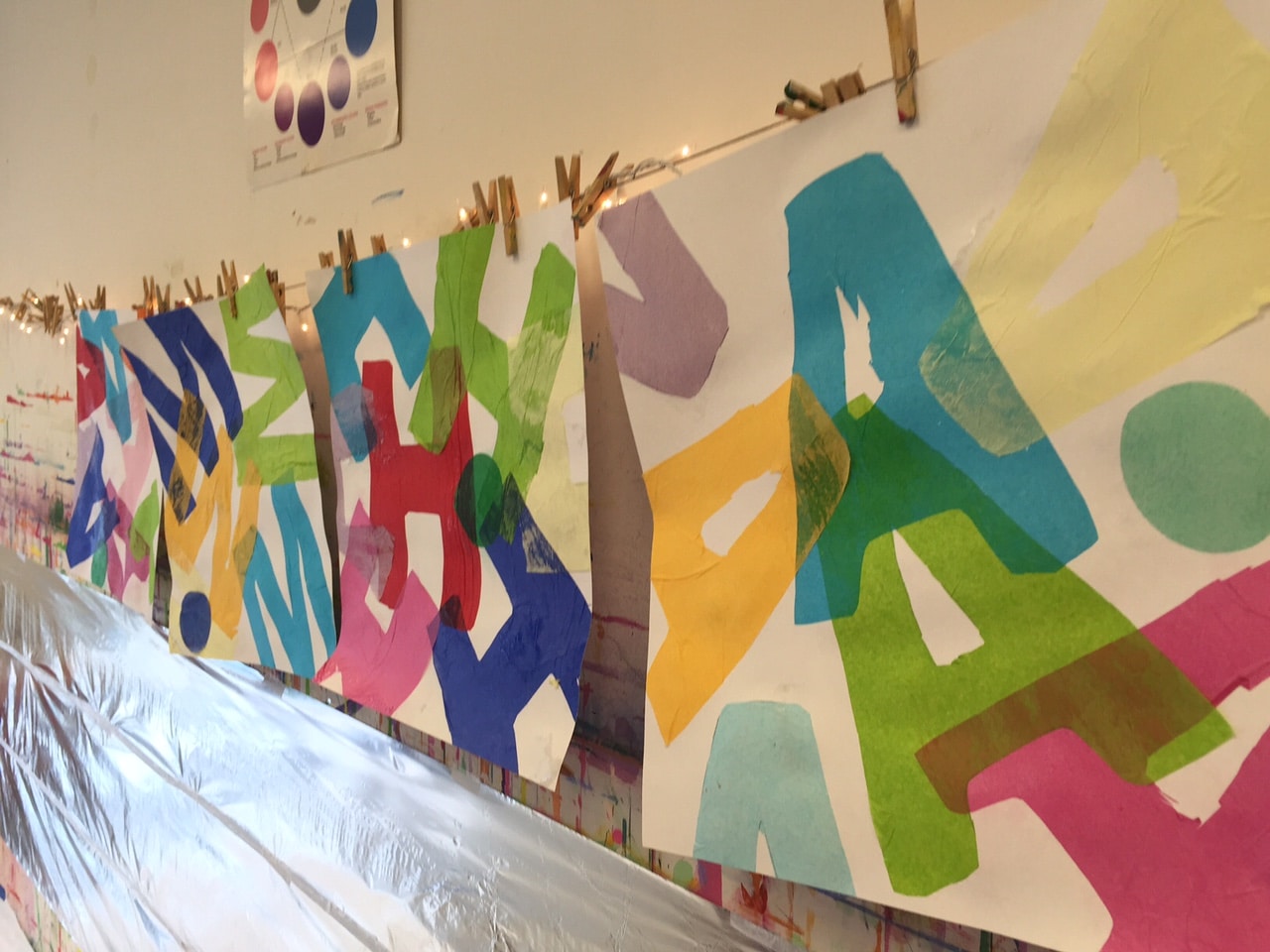
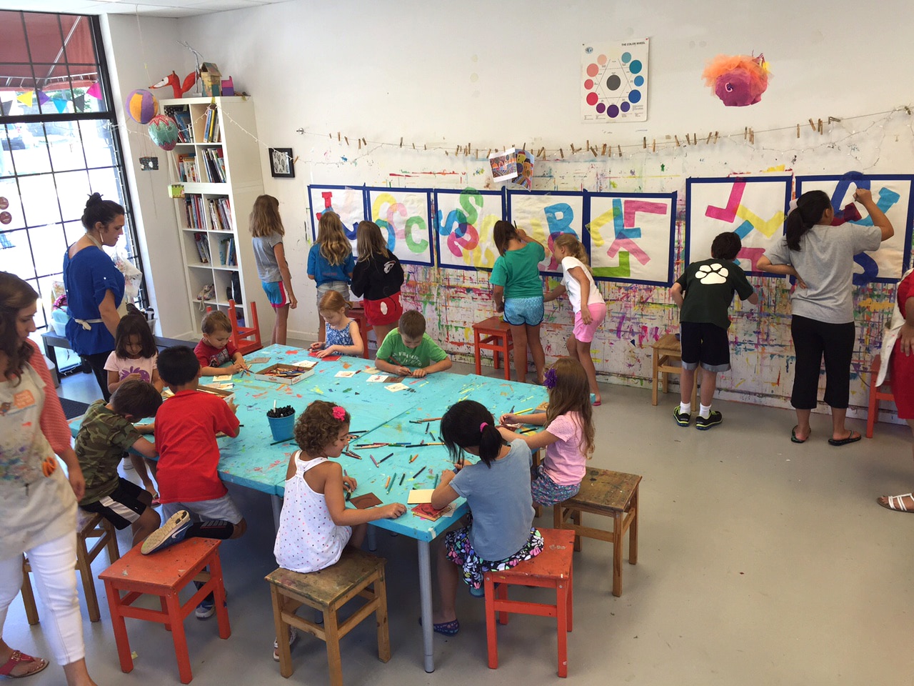
The technique is so simple yet the results are so stunning. Not to mention the kids loved it! We used large 30×30 pieces of heavyweight white posterboard as the backdrop. Someone donated a set of large cardboard letters that the students used to trace the initial of their first name on a stack of five or six sheets of non-bleeding tissue paper. Cutting the letters out was the most challenging part, but they got through it!
They first arranged their letters loosely as we discussed design principles and encouraged them to create visual interest by placing the letters upside down, sideways, and overlapping the edge of the paper.
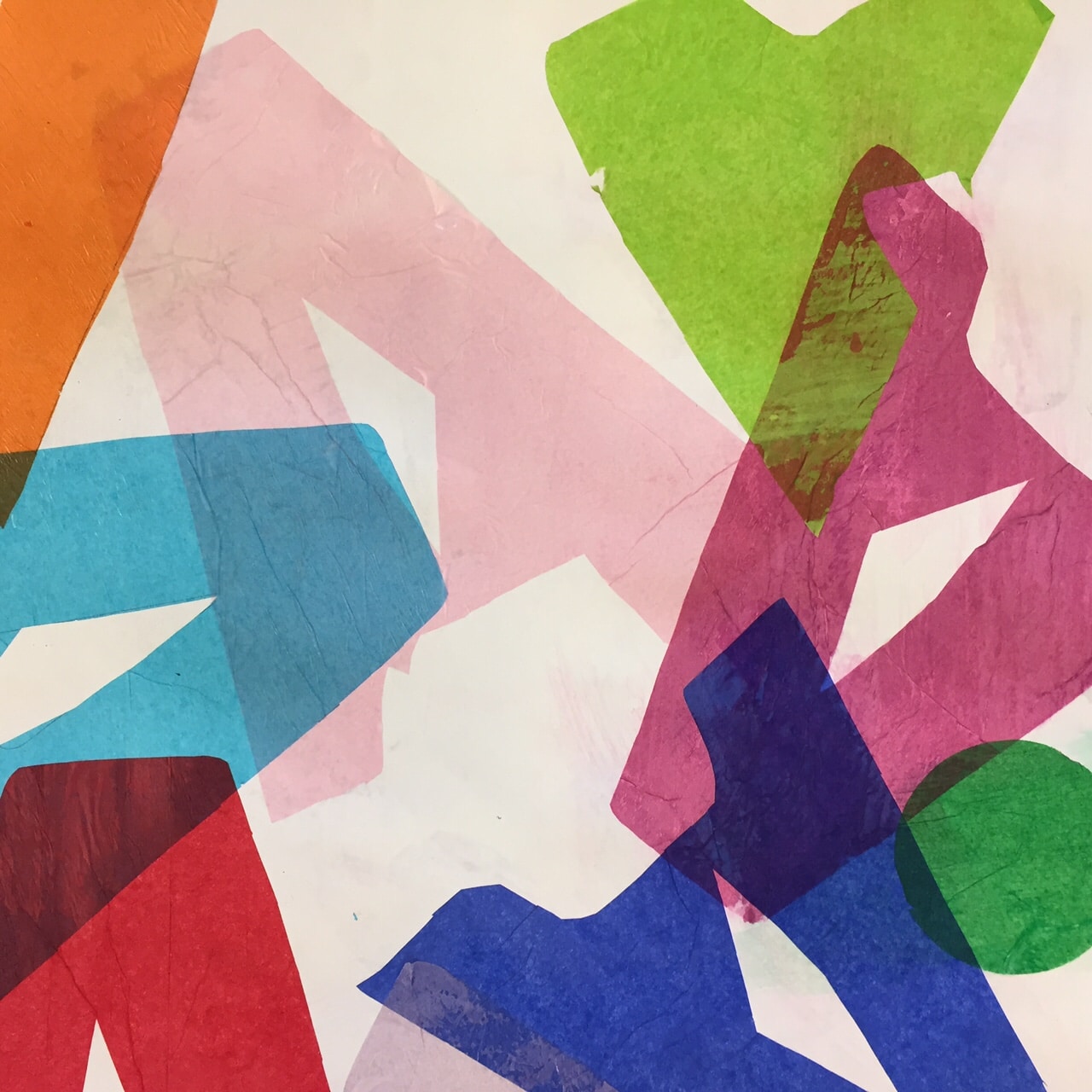
We then discussed how a single geometric shape in a thoughtfully chosen color, placed carefully, can act as an anomaly and add additional graphic interest.
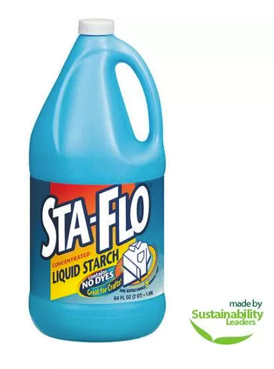
We employed a simple decoupage technique using one of our favorite art mediums, Sta Flo Liquid Starch (liquid starch is a fabric stiffener, found in the laundry aisle of your local grocery store).
Students applied a light coat of starch onto the posterboard with a soft clean brush, carefully placed their letters, then gently brushed a light coat of starch on top, smoothing out the wrinkles as they worked and securely glueing the edges down.
The starch dries in about a half hour and is virtually invisible to the naked eye. It is such a user-friendly “glue” – if it gets on your hands, just rub it in like lotion; it’s not sticky and doesn’t leave a residue.
How incredible is this Decoupage Typography project?

Beautiful! These would be lovely in a preschool classroom! Thank you for the idea!